
Elevating the Visual Design of Soldo
Redesigning the Soldo experience with a user-centric approach to maximise customer conversions across web and mobile.
Overview
Soldo is one of the UK's largest business expense management platforms. They needed a sharper, more intuitive online presence — replacing an outdated UI with layouts that did justice to the product.
As lead UI/UX designer on this engagement, I created new visual systems that landed with more impact than the existing experience, focused on conversion across every touchpoint.
Understanding
the problem
The site looked dated and disengaged. We catalogued the recurring issues holding the marketing experience back.
And many more...
Goals
Improve visual design
Refresh the site with modern, eye-catching design that replaces outdated visuals and highlights Soldo's innovation.
Revise content layout
Simplify information and make it easier to navigate, so users grasp the offering quickly and act on it.
Elevate engagement
Sharpen CTA placement and make content feel relevant, personal and worth interacting with.
Solution
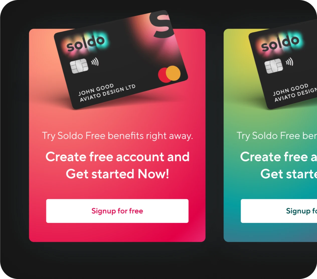
Explored Effective Web Banners
Bold, brand-aligned banner concepts highlighting Soldo cards, tested across every device size for maximum first-glance impact.
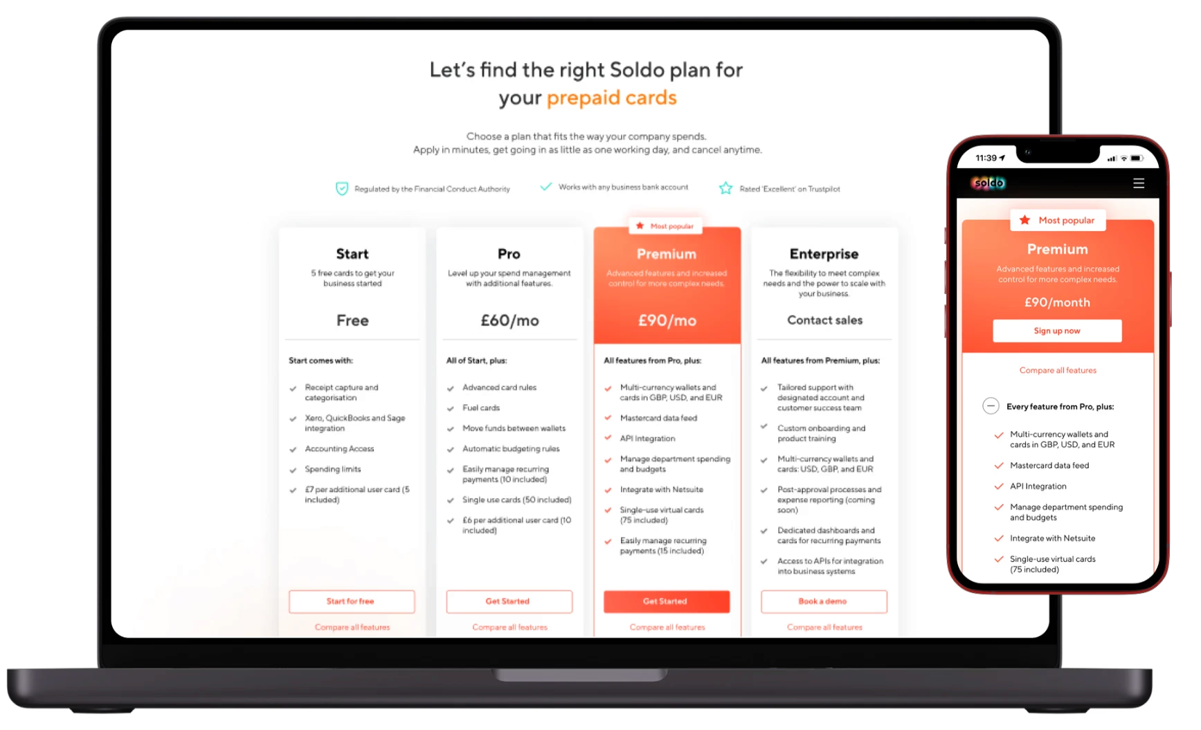
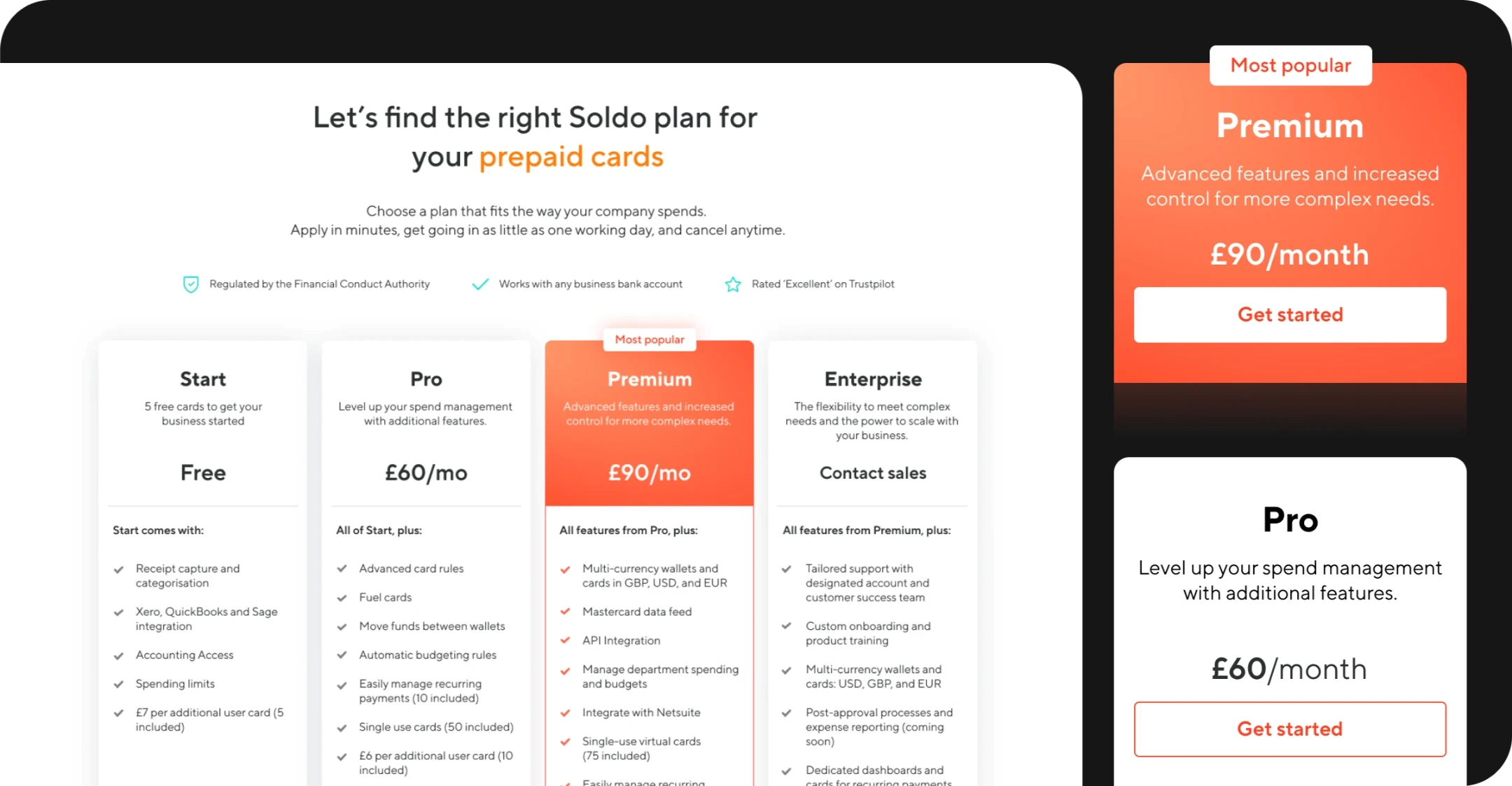
Optimized Pricing Plans
Redesigned plans with a clear ‘most popular’ tier to drive conversions, fixed visual inconsistencies, and tightened the mobile layout — all without breaking the brand.
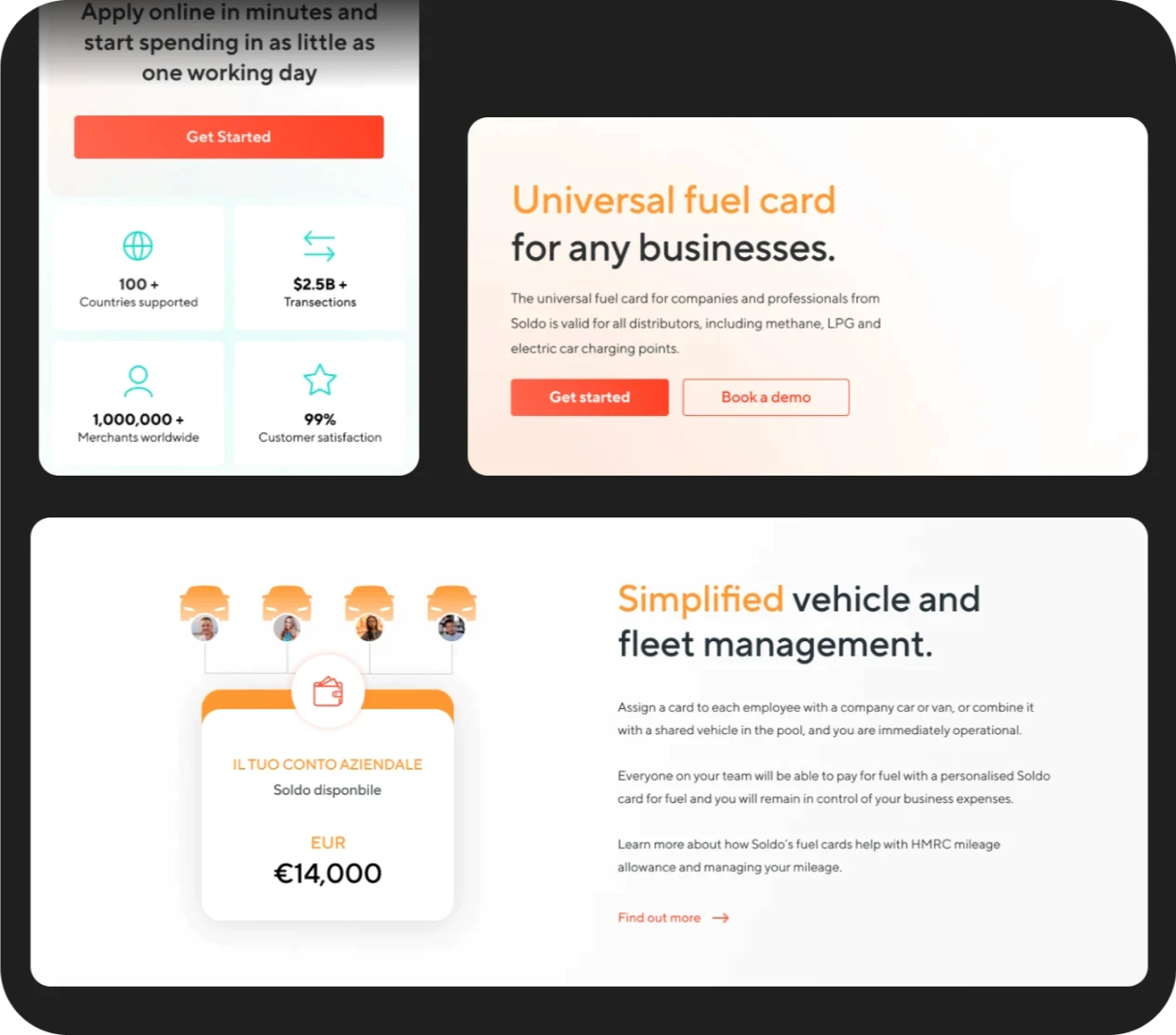
Improved Section Content & Layouts
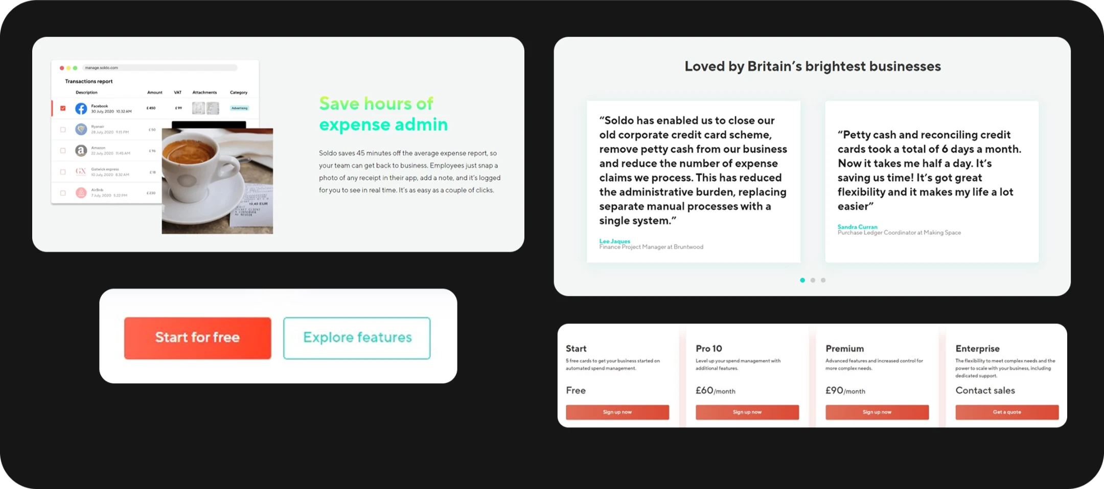
Broke text-heavy pages into focused sections with sharper graphics, fixed responsive layout issues, and redesigned components for a cohesive look across the site.
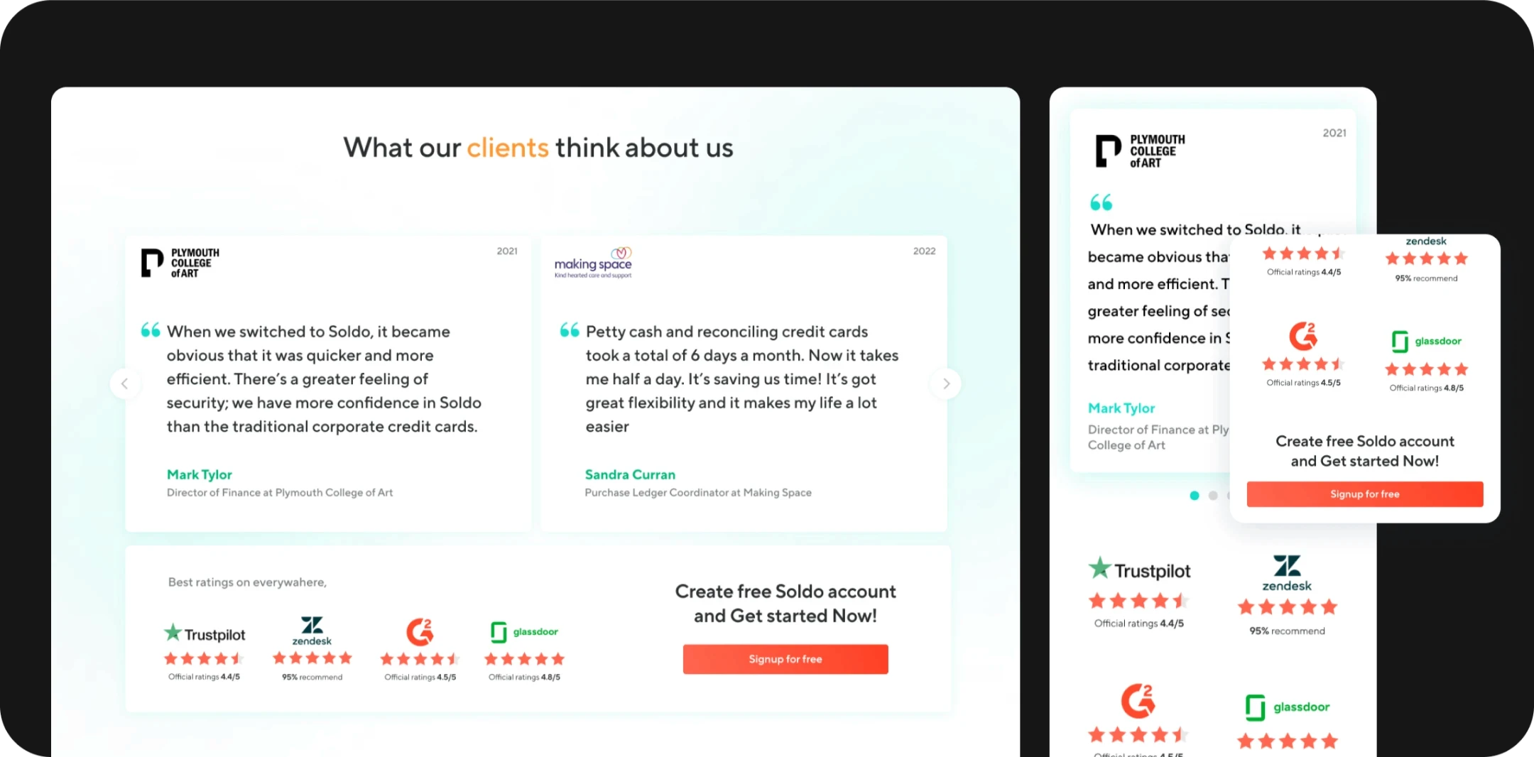
Stronger CTAs & Trust Signals
Reworked dull testimonials into compelling proof, combined with reliable trust factors and a single primary CTA per section.

Better Focused Graphics
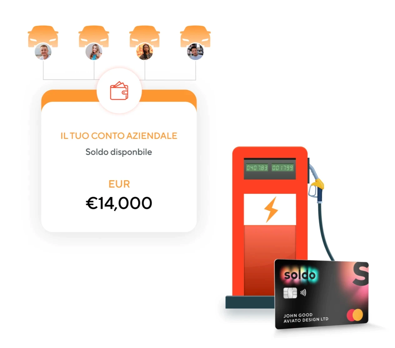
Replaced generic stock with purposeful illustrations that fit the new layout and ease the user's mind through each section.